11.26.2008
11.23.2008
Oh man.

This article just got published this past week in the U of M Record. I got interviewed earlier this summer and had completely forgotten about this. It makes me out to be much more successful than I actually feel and while I am slightly embarrassed, it is pretty cool. The article can be read here.
11.21.2008
Presenting the newest Junior Ranger Booklet (almost)
(from my work blog)
Hi folks!
Well, I have good news and bad news. The good news is that I'm really pleased with how this booklet is turning out. I can't wait until this summer when we can get these activities in the hands of little kids and their families. I wish I could just hide in the VC and watch people's reaction as they discover the new booklets and head outside.
The bad news is that today was our self-imposed deadline to have the Pacific Tree Frog Junior Ranger Activity Booklet completely designed and well, as you'll soon see, it's probably got a few more days of work left on it. I could have stayed up all night to finish this up, but I found the more I rushed the designing process, the less happy I was with the quality of work.
The other good news-- I'm getting faster at this and am able to copy and paste information/design elements between booklets. The second one will be faster than the first and the last one will be done in under an hour. Okay, maybe not.
For the sake of my upcoming role with the RLN Science Communication Workshop, I'm going to have to put these pages on hold until after Dec. 4th. Maybe a little mental break will be good for my creativity.
Other timeline reminder: I'll have the text/content designed by Dec. 18th (when I go home for the holidays), at which point, people can go crazy with the editing. Yes, I know there's some edits that haven't been incorporated yet (Marieke, I haven't put in your latest round just yet), but I wanted you all to get a sense of where this is going:

INSIDE JACKET Okay, this is my FAVORITE design element of the whole book. I think I want this tatooed on my arm or something. There will also be a frog in the lower left corner, welcoming kids to the North Cascades.

I still need to develop graphics for the stamp, badge/certificate, and patch. Anytime you see empty blocks of color, these are just placeholders where illustrations will eventually go.

Okay, this is actually a hard page to lay out. There's still some content that I need to include, but I'm hesitant to add too much information to the map for fear of overloading the viewer (and remember, this booklet is for 3-5 year olds, plus their parents)

I think I'm going to add a ranger hat to the frog.

Okay, this is my second-favorite illustration in the book. I think it's successful because I actually drew it out by hand ahead of time and then worked with a scan on my computer (as opposed to starting and finishing everything on the computer). It's a little bit more loose, but still fits in with the clean graphic style of the other pages. Ah! The little tadpoles are so cute!

(Is the frog closing his eyes or farting?)

Okay, the graphics on this page frustrated me for the longest time, but now I'm happy with the animals on the right and their shading. The shadows help reduce the flatness that sometimes shows up in my graphics. Expect to see more of this.

Some things I like, others need to be fixed. The stylized marmot is from an older project and may rework it. Thoughts? Also, what other animals should I include throughout the maze?

This and the next page have a lot of potential, but because there is so much information (story, side bars, illustrations, connect the dots, graphis within the story, etc), I'm going to have to be smart about the design to avoid a cluttered look. To see how these two pages look side-by-side, I've included the "spreads" at the bottom of this post.


Most of these graphics have been re-used from the Black Bear matching game. I may re-draw them, or I may not. Depends on timing.

This will be reworked so that an illustrated frog sits in the middle and points to a couple of its sensory organs (nose, eyes, hand, ear, or mouth).

Again, another two-page spread. There will be some graphic elements like the inside jacket, as well as totem characters with speech bubbles. Also, human/kid characters need to be included too!

TWO-PAGE SPREADS

Front and back cover need to be designed too. I have some ideas but since these are so important, I really didn't want to rush these illustrations.


Ta-dah!
11.18.2008
11.16.2008
This is why I love Seattle
On Saturday, Seattle, with over 300 cities in all 50 states, protested the passing of California's Proposition 8, which denied gays the right to marry. I think this vote really shocked the younger generation, as evident by this poster:

But shock can be a good wake-up call and my generation, newly-inspired by Obama's successful presidential campaign, is starting to step up. A flurry--no, a snowstorm--of text messaging, facebook invites, and other new social media created a protest/rally in less than a week and brought 6,000 people together.


 (photos courtesy of The Stranger)
This is the first time I've felt a desire to participate in such civic engagement. I guess I always assumed that gaining gay civil rights was going to be taken care of by the time I wanted to get married/have kids. I know that sounds somewhat selfish (ie letting older generations do the hard work). But now, these issues are starting to hit closer and closer to home and I can't just sit passively waiting.
I really really wanted to participate, but was still in Portland finishing up my conference. Fortunately (or unfortunately), I think we're just getting started...
11.11.2008
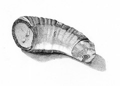
Horn Coral Fossil

Horn Coral Fossil
Originally uploaded by Michael Liang
Another example of being ridiculously detailed oriented. This is done in stipples, ie thousands of tiny dots.
11.10.2008
Ebey's Landing Bird Checklist
Here's a "little" project I've been working on for the past couple of months. You would not believe all the data I had to crunch for this. Basically, this let's you know when to expect over 175 birds at Ebey's Landing National Historic Reserve, and in what abundance. As detail oriented as I am, I'm still terrified that I skewed some data. I need to take a few days off and re-examine it with a fine toothed comb and a pot of coffee. Sigh. This is when I wish I had an intern to be an extra pair of eyes for me. Someday...


11.05.2008
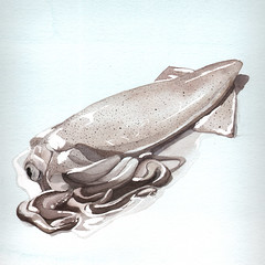
Dead Squid

Dead Squid
Originally uploaded by Michael Liang
My bedroom now smells like the Pike Place fish market. Yum. Watercolor and pencil


